Recent Posts

Tuesday, 15 December 2009

Kyle Cooper


Kyle Cooper is the man for motion graphics. Creating title sequences for a number of films- Seven, Zoolander, The Mummy and The Spiderman series. (Spiderman 2 shown here) He is known for his memorable sequences and even Metal Gear Solid opening sequence.

Sunday, 13 December 2009

Assassins Creed 2


My housemate recently bought Assassin's Creed II for the xbox360, and I was instantly impressed especially with the menu design. The video above displays the menus in action at the beginning and talks of its design related to the game storyline. The flow from menu step to menu step seemed seamless and simple to navigate. Beautiful.

If that doesn't work, click here

First Direct

First Direct Banking


Probably the first advert that grabbed my attention for motion graphics. I wasn't sure 100% what motion graphics was, or how to produce it, but I knew from there I wanted to produce some. With moving type in the same way we all read subtitles, we always focus more on what is being said if its in writing in front of us, and this advert works really well. The black and white simplifies the information, but still grabs your attention with the differences in movement, to keep you interested.

James Bond - Motion Graphics

Incredible films with incredible motion graphic title sequences. The Manipulation of type is beautiful here, revealing key actors and information seamlessly withe sound track.


really memorable motion graphics with lots happening on screen, the duplication of glyphs and symmetry is really nice.

Manipulate- Example styles

Fruit Machines


Train Station


Just a few examples of what I could try and replicate in After effects, obviously with a little practice. Examples of manipulation of type/symbols that could work.

Monday, 16 November 2009

Tea Pigs - Further Research

After sampling some Teapigs tea I bought from The smoothie company, I researched further into the company on their website to see some relievance to the designs.

Hand drawn illustrations aren't really my thing but work really well with the site, but the random little quotes that appear at the top don't really appeal. Why?
What I do like, if the .teas were going to screen, is to have a 'how are you feeling?' tab to help the consumer decide on a particular tea.
When you have chosen a tea, the inform process goes further and each tea is explained and how it is best drank.

Tuesday, 10 November 2009

Talk about pissing on my bonfire.


Scrolling through GE the other day and found an entire tea branding/identity on the site. A little miffed but thankfully nothing i have done to say ive copied or whatever. Nice placement of the leave of the 't' for tea, similar to the .tea I'm considering but gladly not the same.

Thursday, 5 November 2009

What about a label/tag?

On a usual flick through ffffound.com, I came across this bottle of 'forest milk' which includes a little label tag around its neck on the bottle. There is a lot of information I want to put across to inform the target audience about tea, and a small guide of maybe a few sentences could help. I would apply them to the label/tag although they might not be as readable, or clutter the 'K.I.S.S.' intentions of the design. If a label/tag was included, I could also look further into different stocks and print processes on the label/tag, match the colours for different outputs and give a more desirable appeal to the product. This needs to be researched further.

Wednesday, 4 November 2009

YUM.

Strictly not related although I do feel the food relevance is enough reason to post on my blog. Isn't beautifull! Found on graphic-exchange of a restaurant identity by a group called transformer studio. Originally the cup caught my eye because of the definite cues from Chuck Anderson + the relation to my VL type face from the first year made of light.


Monday, 2 November 2009

Spot varnishes


Few examples of what I could find in the flat of spot varnish finishes, my particular favourite is the green and blacks cookbook. The spot varnish has been applied clear and not highlighting a particular area, making it really subtle. Spot varnish is applied as a spot colour (as the name suggests) separately after the initial print process has been completed. Really nice effect that would be great to consider with my tea designs.

Wednesday, 28 October 2009

Colour + image combo.

have to admit, i'm not 100% where this is from, I know its a agency called Absolute Design, but I can't find the physical packaging on the site.. I actually found it on Chloe Galea's blog (thank you chloe) and thought it would be of some relevance.. colour coding as before, simple type and now a simple greyscale image for different themes, works really well.


Chloe's blog is here. Check it outtt

Wednesday, 21 October 2009

Print techniques/layouts.

Martino Jana Design


Joyn:Viscom Workshop


Perky Bros


Tuesday, 20 October 2009

Packaging Research 2 - Share some Candy (refined)

Taking into consideration what I said on the previous blog post fro direction, I have collected these gems from Share some candy, another brilliant site. Keeping it simple and introducing paper engineering.
Yes! someone has simplified things for coffee.. a reason why I don't drink it? why not have it plain and simple english. The simplicity of Tea. which bag, milk, sugar? done. None of this double skimmed tall rubbish.
Printing on glass looks lovely, CMYK and saves on labels + additional materials.
Meant to be a animated GIF file.. buts its not working. See it here. Could be constructing a cup of tea? flip book to construct? Flash animation?
Everything looks better with a smiley face. Fact.
Not even print, punched out of card to create type. Cheaper than print? brilliant.
Why not tins? Simple, perfect storage for tea and just a label to apply. LOOK INTO THIS.
Just a illustration of the product, different colours applied to jars and tins. Too simple? not as successful? almost seems a waste of stock/ink
Clever, but might not work for tea, what could you use?
Mmmm. Ingredients pressed into paper, not 100% on the technique.
Run at the speed of a bullet?

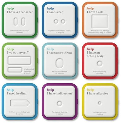
State the problem to find the right solution. 'I need a drink to calm me down', 'I need a burst of energy', 'I want something relaxed' refering to different teas.


Good use of paper engineering to hold products in place. The doritos is only a concept, but works well.

Wednesday, 14 October 2009

Packaging Research 1 - Graphic Exchange

Type set dominate to the packaging design, The quality adds another depth to the design.
The stereotypical imagery relates to the idea of Tea works really well, illustrative and stereotypical route to go with packaging?
Again, the relation to London works really well with a variation on the road signs to the capital.

Colour coding packaging makes it easier to identify the product from a large range, a good possibility for tea with the many varieties available, twinned with a simple design to recognise would make the packaging successful.
Really nice Identity, and simple.
Patterns, and choice of colours work well and make the package look interesting, but not expensive.

Pure type with a letterset feel, minimal colours work really well too, keep costs down. I really like this. Pad printing?
Design continues within the package, usually forgotten, but a great place to add more information. To instruct?

Great photos + colour + type. Nice and simple. Lithography?


Limited spot colours, and a white over print. Knock out? Running theme for Eat. works really well. would this be screen or a lithography process?
Water in a carton, One colour, different percentages. Ethical and cheap to produce. Piece of flexography if decided for a container of some kind.


Old fashion style typeface with a modern twist, kept simple unlike graphic design of the time.. 50's? gloss sits really nice on the jars, smooth and clean.


More colour coding and simple type. Depending on the typeface, can either be value chocolate or an expensive design with finishing print techniques, Varnish?
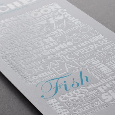

To continue research further, more varieties of simple packaging graphics and clever interactive and paper engineered packages. Look at varnish finishes etc?