Recent Posts

Wednesday 12 May 2010

Coffee dusting - type?


Before this brief, as far as I knew, costa were the only coffee shop to have inventive chocolate dusting on their drinks, which gave me the idea of applying letterforms to the tops of drinks. Originally I was going to apply individual letterforms per cup/mug of drink and create a typeface that way, but experimenting and researching into 'coffee dusters' apparently you can create quite intricate detailed designs to be dusted.
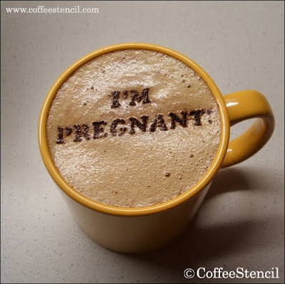


This opens up the possibility of creating a typographic composition instead of an entire typeface, creating a complete scenario for the cup or, allowing for a good square format advert space (with compromising on scale)


This piece from Carina Tous, demonstrates a similar effect onto a napkin styled stock. Could i apply type to stock?

Monday 10 May 2010

Screen Ad Formats.


Click to view at actual size.

To get an idea on what im working with when designing for screen, through google I found a sample ad formats and their sizes to design to. My intentions are to design for print, then apply the designs to screen to allow for a wider distribution. Next step to apply designs to this scale to see if they are possible.

Wednesday 5 May 2010

Skype visuals/interface

The visuals for skype are very clean and strong/vector styles throughout the site. I assume for ease of translation between countries and cultures. Should this be considered? or should I continue with a strictly english speaking design direction? I would hope that the final chosen typeface/treatment will be readable no matter what language. 


The visual identity of the Skype brand is already very strong, so I feel the branding should be incorporated in someway so you can still recognise it as skype, Even if its in a subtle way recreating the outline of the logo, or altering the colour scheme to my chosen colourway.

Although aware of what Skype is as a program and a service, I have never actually properly used the software before. I downloaded the program on the website which was an absolute breeze- clear and concise information directed me to the right link, the charges and how simple it was to start. Program loaded as it would, I created myself a Skype name and continued through to the first screen. Easy peasy.


The interface itself is straight forward too, not showing unnecessary information and opening windows/boxes through simple navigation. With only a few contacts and imported information from ical, my Skype looks relatively bare, but with more contacts added soon, more functions would be available. 
I feel this ethic and tone taken to producing the skype interface needs to be translated into advertising and express the ease of use and flexibility available.

Tuesday 4 May 2010

I love dust


Originally taken by this piece because of the use of a laser-cutter, the variations in typefaces and decorative feel work really well. i would really like to use the lasercutter, its just finding a relevance for it.


Exploring the portfolio further, I came across this series of advertisements for the Highways Agency using a combination of handmade type and found objects to attract attention. 


Again I really like the variations of type applied together, especially the road signs 'updates' 


Monday 3 May 2010

Handmade Typefaces. Arranged + Found.


Vladmir Koncar


Robert Bolesta


Kimberly Reynolds


Camille Lebourges


MEStudio


Daryl Tanghe


The selection shown here are of arranged and found handmade typefaces, arranging found objects to create letterforms. Especially Vladmir Koncar, the typefaces created are replications of existing typefaces but with different materials, instead of creating an entire typeface from found objects, so giving the design some direction to work to from the start.